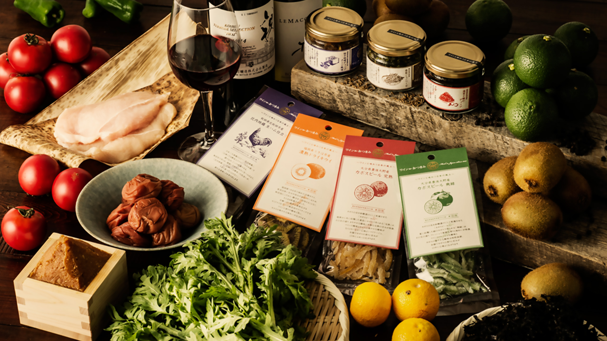
“Wine to Otsumami” is a branding project of ‘otsumami=snacks’ specialized for drinking wine, realized by collaborations of local industries and Japan’s one of the largest wine importing company.
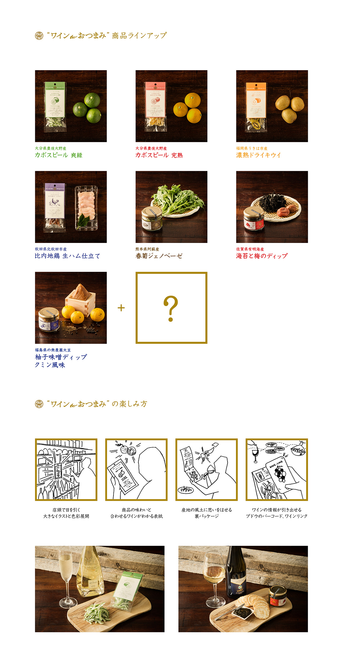
Although Japan is famous for its rich food culture, ‘otsumami’ for wine are often imported as well as wine itself. In this project, provincial specialties are arranged as ‘otsumami’ for wine, and aims to expand its market utilizing the original wine distribution network. By dispatching not only the food itself but also the context of the product, this project aims to cultivate lifestyle and culture with wine in Japan.
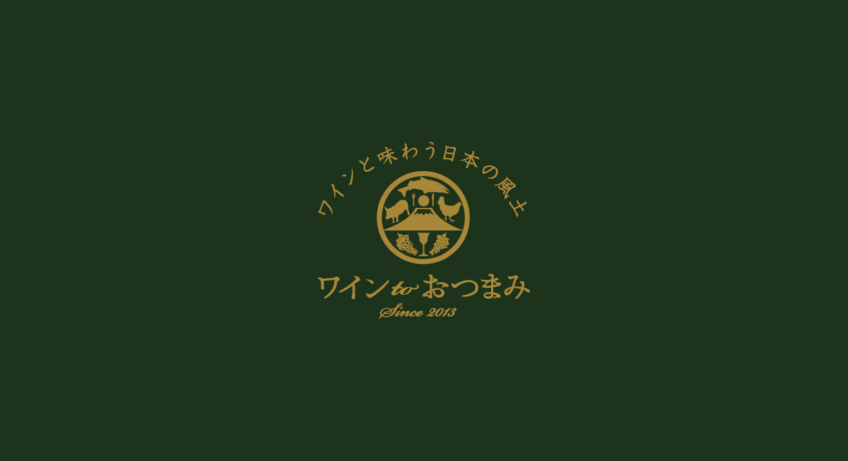
The logo for “Wine to Otsumami” is designed to introduce the new wine culture to be constructed in Japan. Mount Fuji symbolizing Japanese culture and a goblet symbolizing wine culture, are surrounded by variety of food and bunches of grapes, forming a logo that strongly reminds of Japanese family crests ‘kamon(家紋)’. To express the luxurious feel of Japanese culture and wine culture, the color gold is adopted as the brand color.
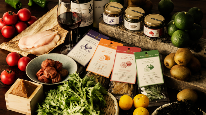
Clear containers and large illustrations allow consumers to understand the products by glance, and packages that prints not only about the contents but also the context allow consumers to dig deeper into the origins of each product. Color variation is carefully selected from a masterpiece in Japanese painting, “Shikikacho zukan” (Scroll of Flowers and Birds of the Four Seasons) by Sakai Hoitsu, to express the rich color in Japanese culture and climate. This package design aims to offer a compound experience of taste and culture of Japan.




-
ClientM.O.T.
-
Food CoordinationM.O.T. (Michiko Ohashi)
-
Creative Direction + Art DirectionSUGAWARADAISUKE (Daisuke Sugawara)
-
Logo DesignPASS (Shoichi Wada)
-
Tool DesignSUGAWARADAISUKE (Daisuke Sugawara, Azusa Ichimura)
-
IllustrationAki Miyajima
-
PhotographyAkira Sato
-
HP

